DoctorLink: Setting up a Design System
DoctorLink: Setting up a Design System
Services provided
Specialities involved
Services provided
Specialities involved
DoctorLink is a healthcare technology company with a mission to simplify the route to health and wellbeing for patients globally.
The prologue
DoctorLink partnered with YLD to help redesign the user interface and improve upon the UX framework of their cross-platform product. This eventually evolved into the creation of a Design System and the introduction of DesignOps resulting in a cultural shift in their entire organisation.
Finding common ground
We initially conducted a series of interviews with different stakeholders, aiming to capture a wide spectrum of beliefs, motives, intentions and expectations regarding both the company and the product.
We assessed the overall state of the product and how it responded to users’ needs and expectations as well as business goals. This work relied on analysing user feedback from usability testing as well as survey data from existing customers.
By identifying common themes and collaboratively consolidating discrepancies, we were able to formulate a set of principles. These principles encapsulated shared criterias for value, quality and success that were suitable not only for the design or engineering teams, but rather the whole of the company.
Seamless.
Empowering.
Universal.
The product principles
These broad principles ensured that the product was seamless, empowering and universal to all users
We were able to benchmark all subsequent design decisions against these principles.
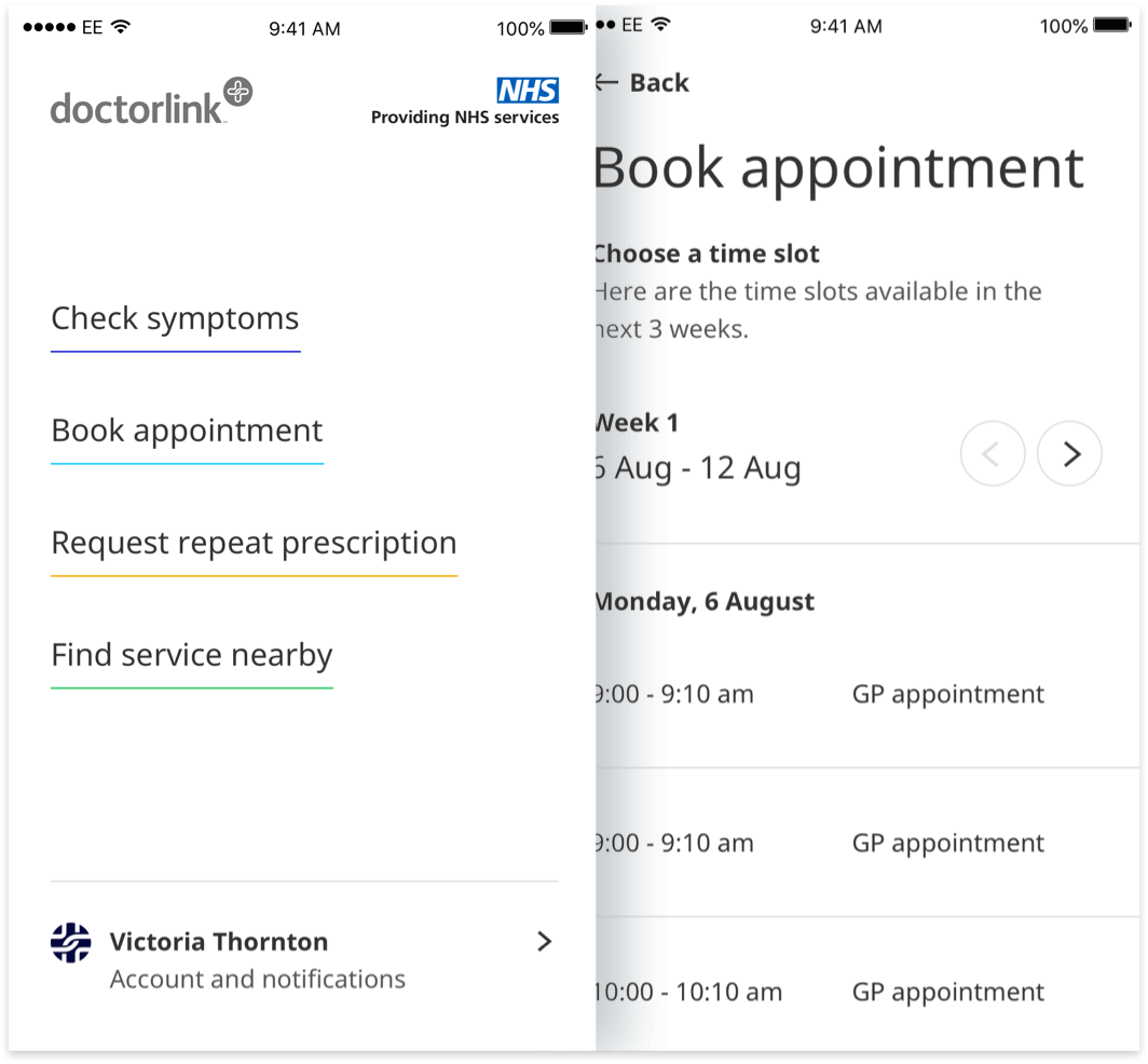
A new visual language
The most immediate task was assessing the existing UI components and patterns from a usability and aesthetic perspective, in order to improve upon them.
Armed with our recently defined principles and user feedback, we redesigned the UI and visuals from the ground up with the aim to create a recognizable visual language that mirrored the new principles.
This assessment gave us a perception of the visual discrepancies between the design files and the final code, which helped us bridging the gap between engineering and design.

Typography
The original Albert Sans typeface was replaced with the open-source Noto Sans - a highly supported typeface characterised by a sound balance between form and function, which offered the global versatility of including over 800 languages.

Colour
We also took this blank slate as an opportunity to reinvigorate DoctorLink’s colour palette, while being carefully faithful to the legacy of the original brand colour - which had emphasised the product’s ties to the UK’s NHS. The new ‘DoctorLink Blue’ offered a stronger, modern and confident identity to the visuals and also helped the product gain the highest degree of visual accessibility.

Illustrations
In order to further lift the brands humility and character, YLD set about enriching the product with an array of custom illustrations, offering visual delight and conveying abstract concepts succinctly.




Protoyping and fast iteration
As we started to create some of the initial UI components, we simultaneously conducted user interviews and testing.
We quickly identified components and patterns that worked, and ones that did not. Those that did were consolidated into the burgeoning Design System.
It was a granular approach that allowed us to amass a collection of effective layouts and composites, confident of their performance. We continued this practice as the product grew, constantly adapting to test larger considerations, such as user flows and journeys.

New design methodology
Baseline grid
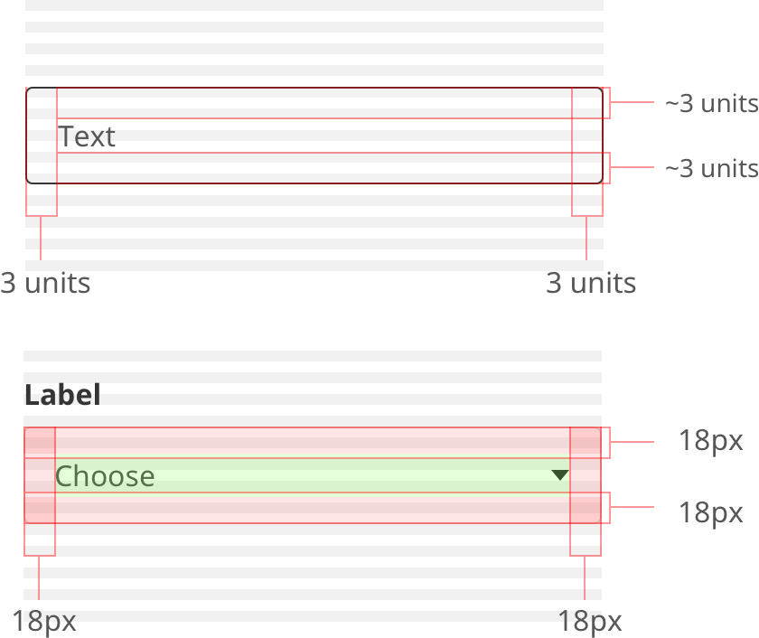
By implementing a baseline grid we were able to implement an invisible structure that helped us to organise graphic components vertically and contributes to consistency of the layout.
The grid was created by picking a value that is divisable by the different leading values used in common typographical components. As the two most common typographical components are body text and title text, with leadings of 24px and 42px respectively, we resolved to implement a baseline grid of 6px to allow us the flexibility to divide the space vertically without overcomplicating it.

Base unit
This base unit of 6px helped us tie in all of the UI components with typography and make the process of deciding on the sizing and spacing of components faster and intelligible, by eliminating any guess work.
Automated design
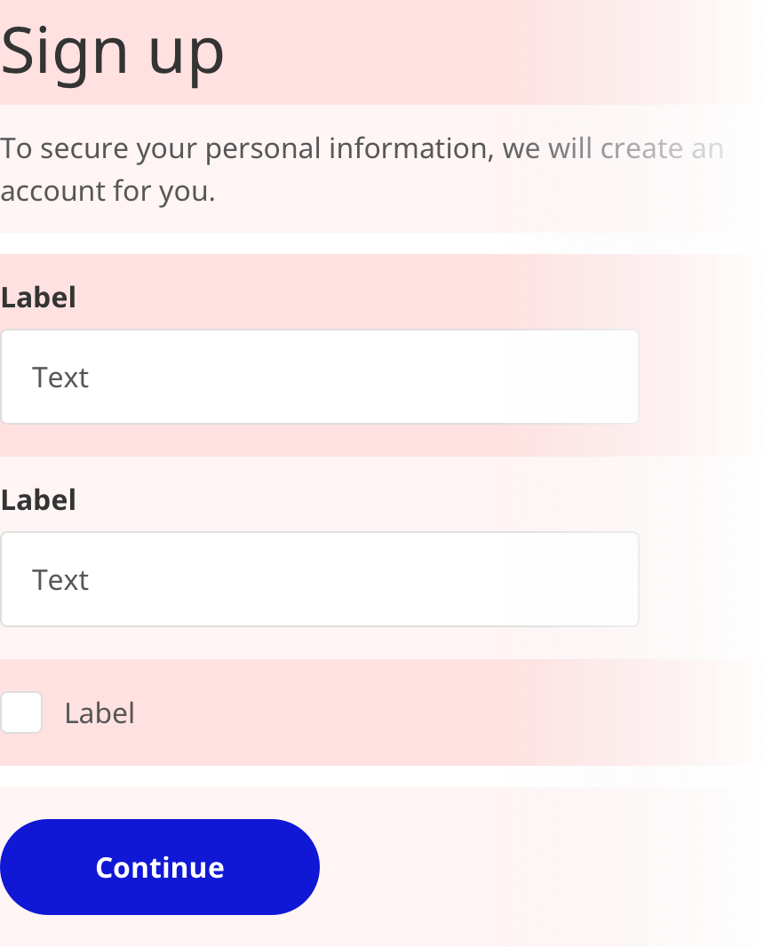
By embedding default minimum amounts of padding within the design assets and utilizing Sketch’s scaling constraints, we were able to automate a lot of production work, reducing components to a series of stackable blocks. This substantially increased the quality, consistency and speed at which design work was produced, as well as allowing more time and thought to be spent on flows and behaviours.
Documentation
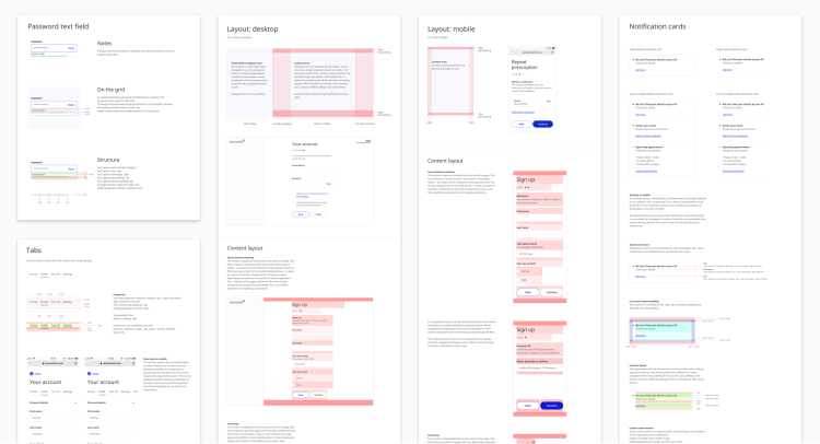
As the Design System expanded, the process of creating visual components was standardized by writing a small set of clear design rules that could be understood and applied not only by designers, but also engineers, regardless of their level of expertise.

Extensive documentation
We then expanded and supported these rules with extensive documentation for each individual component in the Design System. This prevented incidental design decisions and ensured consistency of the product. It also guaranteed that these rules could be consulted and referenced even long after we’d left the project, offering each member of the design team a real sense of co-authorship, meaning that all expertise were considered and leveraged.
Aligning design and engineering
As we had identified early on in the process, improving the collaboration with DoctorLink’s engineers was imperative to the product’s success. With their enthused support for the Design System, we were able to establish a universal language of naming conventions and design tokens that transcended both our disciplines. These agreed formalities were accompanied by a YLD initiated handover process and the establishment of a forum for Q&A.
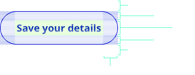
Properties
Height: 54px
Minimum width: 150px
Top margin: 18px
Bottom margin: 18px
Corner radius: 27px
Border: 1px
Text style: NotoSans Bold
Text size: 16px
Text line height: 24px
Text top: 15px
Text bottom: padding 15px
Text left padding: 24px
Text right padding: 24px
Tokens
$height-button
$width-button-minimum
$margin-button
$corner-radius-button
Border: 1px
$text-size-body
$text-lineheight-body
$padding-text-button
Reaping the immediate rewards
Having the Design System in place began to reap rewards instantaneously. The first immediate improvement was in the communication between the design and engineering teams. Ambiguity between the two teams was successfully reduced, leading to a much quicker and accurate turnaround, substantially improving the clarity of content, brand recognition and user trust.
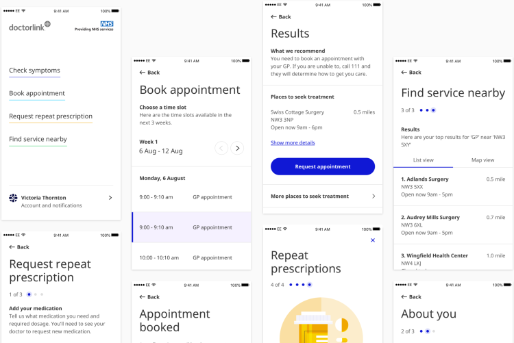
The product blueprint
Documentation was the cornerstone for these substantial leaps forward, which helped form the blueprint of the Design System and thus the product. The aforementioned need for the Design System to resonate with users from different disciplines and levels of expertise was realised when we were able to easily and clearly onboard numerous new joiners within both design and engineering without issue.
Documented content layout

Product implementation

Improving our process
There are a number of factors that can disrupt a Design System, from incorrect or unapproved components being added, to documentation being ignored. As such, we repeatedly reinforced and built upon our processes. An internal design team review was established to highlight new components and ensure visual continuity, as well as a monthly design and engineering review, to increase the transparency of work and ensuring both disciplines are aligned.
While Design Systems enable the creation of consistent, scalable products they in turn require a team, constant maintenance and the correct processes to support them. It was an important takeaway, but ultimately, Design Systems can be fallible because we can be fallible.
Leaving in good health
Through our application of user-focused, evidence-based data that dictated the logic and rational behind a sleek and engaging interface, we were able to expand and improve upon the core offering of the product. We left having set in place a foundation from which DoctorLink will no doubt build, adapt and thrive upon.
Featured work

Central Working
Central Working: Changing how you work
Central Working
Central Working: Changing how you work
We dug deep into Central Working’s core values to rebrand and redesign their digital and printed marketing materials in a way that personified the company character.

Joyent
Application awareness for Joyent
Joyent
Application awareness for Joyent
We created an application management platform that incorporates Joyent’s cloud infrastructure service and application orchestration software, ContainerPilot.
Canon
Canon: giving stories a new form
Canon
Canon: giving stories a new form
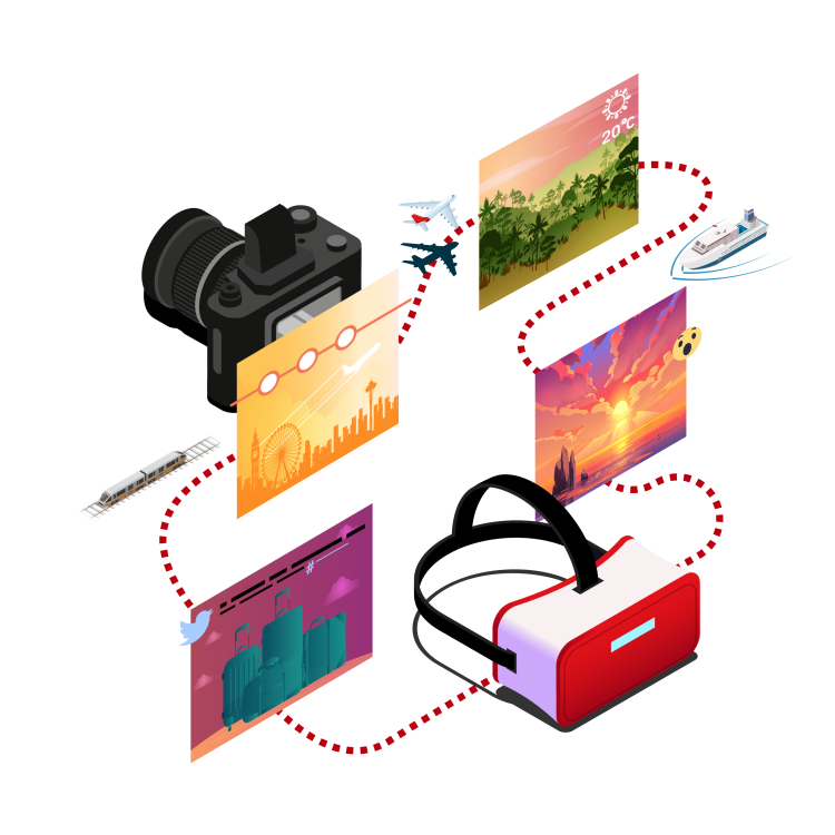
We built a three-dimensional VR product, that created a new way to experience photographs, and the memories connected to them.
